Friday, December 11, 2020

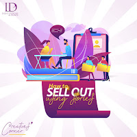
The Dos and Don'ts of Storytelling


It’s a lovely Friday again! A day to take stock of the week and to start preparation for the next. I am grateful for you, what are you thankful for?

In my last post, we talked about using stories to sell out. As you know already, we are learning together, so tell me, I would love to know how much my blog post helped you. For me, I got two new clients, isn’t that awesome?

Do you know that storytelling is like your cloth? Each style, each colour, each combination is for different occasions. Just as the black colour is used to mourn in Africa, the white colour is used in eastern Asia. You wouldn’t wear a flowing dress to do farm or factory work, neither will you wear a wedding dress if you are not the bride. Each cloth has its own relevance. And you have to follow the silent rules guiding the use of each. Likewise, your story, you have to follow its guiding rules. So, let’s jump right into it.

The first do is that your story have got to matter.

It shouldn’t happen that after your audience finished reading that story you have written, then they are more confused than they were before reading. They try to think back about the story but still can’t get a connect of what you are trying to say or calling their attention to. Your story needs to have a point, a clear point at that. With that, even if you are trying to sell a product or service which I believe most of us are, your audience will be able to relate your story with your product or service.

Let your story be in the right detail!

If my post is getting unnecessarily long, I bet you will get tired of it and move on without completing it, that’s just what a reader will do to a story that is too long. What if your story is too short, just straight to the point, it really wouldn’t be interesting enough to catch your reader’s attention you know? Therefore, there is a need to have your story in the right proportion, with just enough details to catch and keep a reader’s attention.

You can weave your stories into the beginning and end of your presentation

Be it a written or spoken presentation, you can catch your audience’s attention with this. Starting with your story, linking it with your product in the middle, and finishing with the story.

Avoid losing focus!

As much as you are trying to tell a story, to catch your audience’s attention, you shouldn’t lose yourself in the story, thereby overlooking or totally forgetting the main reason for that presentation. It must not happen. No matter how much you enjoy relieving that moment, no matter how much you enjoy talking about that experience, you have to time yourself, so you don’t shoot yourself in the leg.

With these dos and don’ts, I know storytelling will become a lot easier for you to do to make your sales. Don’t forget that storytelling in making sales is as important as your salt when cooking.

See ya!


Friday, November 27, 2020

How to sell out using stories


You know, getting people's attention can be a lot of work. Everybody is busy with one thing or the other and if whatever you are bringing to the table is not exciting or inviting enough, they air you.

Sometime last year, during my stay in a camp, we used to have hours of lectures everyday. And since our facilitators were not storytellers, but bores, almost everybody got tired easily and ignored them, well I did too at some points.

We had one particular facilitator though who would always engage us with songs, or stories, it was actually hard to ignore her because she didn't let us, she was interesting. I can say she is the only one I still remember since I left the camp, just because she caught my attention.

Can you see the importance of storytelling? It catches people's attention. If you know how to play your game well, it keeps their attention. So, let's dive right into talking about how to sell out using stories.

According to Google, Storytelling describes the social and cultural activity of sharing stories. Remember that before writing came into being, storytelling had been. Therefore it can be said to be an effective tool in passing down history and information.

So, how does it affect sales? Storytelling majorly, to affect your sales, catches your audience's attention, it gets them to know all they need to know about your product, they stay hooked and convinced to buy your product. Indeed, it has become an effective tool in closing sales.

So as a business owner, how can you write your story in marketing your products?

When writing your story, it's better to go from the KNOWN (the problem) to the UNKNOWN (the solution - your product). And it will be better if the problem is one you have experienced before. But please note, if it's not something you have experienced before, lying in your storytelling is not advisable.

So, you can catch your audience with your story about how you felt when you had the issue. And then flow to how your product has helped you overcome and how it can help them overcome too. 

Let's give an example. Imagine you wrote a book for getting out of depression just after you got of of depression too. And of course, what is written in the book is a combination of all you did to get out of your depression. Your story will be an attention getter for your audience if you start from when you were battling with depression (relating with their problems) and then you move on to how to combat it (introducing your product)

With this format: Identifying with the issue, to introducing your product as a solution, your storytelling will flow, grabbing people's attention and keeping it intact till sales, you can be sure to sell out using your stories.

In the next post, we will talk about the Dos and Don'ts in Storytelling. See ya!

Friday, November 13, 2020

Getting into your Customer's Mind


Gosh! It’s been a long time I wrote, and it’s been bothering me. Yes, I can say I have my reasons for going off, which was fear and uncertainty (well, nobody is immune to it you know). Despite the fact, I would always convince myself every Friday of why I did not write/post. And today, I have decided to forgo it all, take my time, sit my myself down and write what comes to mind. All I know is I have overcome the reason I went AWOL and I am back. I am glad to be here for you and I promise to do my best with it. Kindly subscribe and tell your friends about Creatives’ Corner too. I look forward to having you all read what  I have to post about Creativity, Business and Creativity #smiles

So, this week, in a class that I have been attending, I learnt something and I will definitely love to share it with you. I learnt that being an entrepreneur is creativity. Why did my teacher say that? Well Entrepreneurship which is different from being a business owner involves a whole lot of thinking. As you are thinking about your product, you are thinking of your investors (if you have), you are thinking of your customers, you are thinking of your team members, you are thinking of the brand and of course you have to think about yourself too. And all these entities, must be satisfied by decisions you make. They must grow and not remain stagnant. That is a lot of creativity if you ask me.

Dear entrepreneur, out of all these entities that you have to think about, let’s focus on your customers in this post. Have you ever wondered about how to satisfy your customers? Or is it even a present challenge you are facing? Then let’s talk about getting into your customers’ minds. How exactly are you meant to do that? 

The first thing I will suggest is to spy on them. Do surveys, not the ones they will know about now, unknown surveys. If your product is meant to be going to or is in the market place already, go to the market place, watch them. Watch what they do, how they react to your product, what they complain about, what they love. In that way, you can be able to understand from their point of view as the user and make necessary adjustments. Don’t forget that for this survey, it’s without their knowledge, I suggest you go to the market disguised as a buyer. Of course, it can be a huge time investment, but it is a good one.

Another thing I will say is for you to carry out known surveys; video, physical or online. Remember the first is about doing the survey without their knowledge, this is with their knowledge. Ask for feedbacks! Let them tell you what they think about the product. Let them use it in your presence. Ask for what they would have preferred instead of this. Actually, this is always best done before you take your product to the market but it’s not too late to be done even after you take the products to the market.

In getting into your customers’ minds, you need to be understanding. You can’t afford to get these people’s feedbacks especially bad ones and flare up or get discouraged, always remember that it is for the better. Remember, they are the ones you are producing that service/product for. If they don’t buy, then you run out of business. And as Danni Friedland said in one of his posts that ‘You should aspire to create value for your customers by helping them get what they need’, therefore, they have to need and love what they buy or the service they get so that they can come back.

Let your customers see that you care about them, listen to them, understand them, ask questions and listen again. When they make calls in, let their experience be amazing, let them have that feeling of accepted, understood and valuable.

With these, you should be able to think like your customer and produce that exact thing they need which will definitely keep you in business.

Let’s do some entering into our customers’ minds this week. And don’t forget to tell me and the community all about it.

Thank you for reading! See you next week! Looking forward to hearing from you about your experience.


Saturday, August 22, 2020

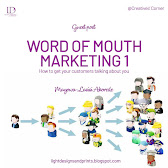
Word of Mouth Marketing 1


Hi guys!!! I am so excited!! Guess what?  Creatives' Corner has her first guest post!! Drum roll!! Are you wondering what it's about? You need to check the full gist out. It's about Word of Mouth Marketing, how to get your customers talk about you. Yes...I know you are interested, why not follow me.

A quick introduction about the writer, he is a friend, his name is May-Las Akorede and he is so excited to have you read his post. Let's go.

Sometimes towards the late ember months in 2019, I stumbled on a couple of information that has changed my views on business and how it's been run. I decided to follow up on that information and I started digging and researching hoping to uncover more information – well, I'm not done uncovering – but the good news is I've uncovered some pretty good stuffs that I believe every business owner should begin using NOW. Not tomorrow, but NOW.

I know a lot has been wrought in you up to this point and I don't take it for granted, and all I simply need is for you to have an open mind and be receptive to some of the insights I'll share. They've been time-tested, and experienced personally.

My name is May-Las Akorede and I run a photography business, a real estate business and a consultancy business; let’s just make that a form of introduction of myself.

“How much you grow is dependent on the quality and quantity of information you have access to. This is the Knowledge Economy” – Debola Deji-Kurunmi

Let’s Begin!

Have you ever had a nice time at a restaurant you visited for the first time, and when you got back home, you told someone about your experience at the restaurant? 

Or have you ever watched a cool movie or listened to a really nice song and you tell your friend about it? 

Or you just bought a new pair of shoes and every time you wear it; you always want to snap pictures and post it? Or in some cases, you want people to actually see the shoe on you?

You’ll most likely answer yes to one or more of those questions or know someone who has engaged in something similar. The real challenge is in knowing how – a business owner – to engineer such situations in your products and services also, such that when our customers patronize you or use your products, they just can’t hold it to themselves and they become advocates for you, telling their friends and families about your business and how cool it is to patronize you.

Do you know that on an average, people share more than 16,000 words per day and every hour there are more than a 100 million conversations about brands, products and services?

People love to share stories, news and information with those around them. The things others tell us or text us about, have a significant impact on the actions we take, on what we think, read, buy, watch, sing, do etc. We watch movies our friends recommend, we download songs people talk about, we read books our friends praise and often times we vote candidates our friends and family endorse. 

Word of mouth is the primary factor behind 20 percent to 50 percent of all purchasing decisions.

So, while traditional advertising is useful, – still very useful – word-of-mouth marketing (WOMM) is at least ten times more effective and I’ll give two major reasons for that;

Word-of-mouth is more persuasive. Ads tell you how great a product is, and because ads always claim that their product is the best, they’re not really credible. Most people don’t believe ads and you can almost count the number of times you’ve seen an ad and immediately respond to it. You won’t find an advertisement that would “shade” their product. However, our friends tend to get blunt, they tell it to us straight, they just simply call a spade, a spade. If they believe a product is great, they’ll tell us exactly that. If the product is bad, they’d also tell us. We trust our friends more than we trust ads. We listen to them. We believe them.

Word-of-mouth is more targeted. A lot of businesses advertise in ways that allow them to reach as much number of interested customers. That might not be really efficient because many of the people who see the ad may not need your product/service or may not need it immediately (P.S I'm not against ads, I advertise for my business also, but minimally, I focus more on word-of-mouth... I'll advise you do both). Word-of-mouth is naturally directed toward an interested customer. We don't share stories with everyone we know. We select particular people who we think will find it valuable. You won't tell a friend who doesn't have children about a new diaper. Word of mouth tends to reach people who are actually interested in the "thing" being discussed. 

And we believe our friends more than ads, because we know they're mostly not working with the company in question. And Word of mouth gives you infinite return for little investment on a customer. That means, from one customer, you can get an infinite chain of other customers.

This implies that as a business owner, you should find a way by which conversations about your business is infused into people's daily "small talks". Those "small talks" of theirs can fetch you big money and influence.

WORD-OF-MOUTH MARKETING AND “TRUST” FACTOR

Essentially, word of mouth marketing can be summed up in a single word: Trust.  People trust other people and the experiences they have to report, which means when they hear from a friend or a consumer about a product or brand, they are more likely to buy. One person will tell another, and that person will tell someone else. Then that person will continue the chain and spread the word further.

According to a Nielsen study… 92% of consumers believe suggestions from friends and family than other advertising. If 92% of consumers prefer suggestions from their friends then WOMM is valuable. Plus, having good WOMM amongst your customer may make it easier for you to ask for referrals. Consumers do not only make up their minds through advertising messages but through word of mouth recommendation from a trusted source.

Wow!! Word of Mouth Marketing!
I believe you have learnt something like I have from this post. Of course, you know this is not all. More to be posted as time goes on. Just watch out. 

Thank you for reading! Thank you for subscribing. It means a whole lot to us. Don't forget you can send in requests for topics to be discussed. Also remember to invite your friends and let's enjoy in our corner together.

See ya!

Saturday, August 15, 2020

Overcoming Discouragement as a Creative 2


It’s a new week and I am so grateful. Shout out to all readers. You guys rock! I know you must have wondered what happened last week, a lot did. But here is your compensation, two posts this week!

So, in my previous post, I wrote about overcoming discouragement as a creative. I know you know that being discouraged is not a bad nor a new thing. Therefore, I want you to know that overcoming discouragement is a great achievement. I spoke to some friends who are creatives recently and they shared their experiences and challenges in our creative world. I am sharing it because I believe it will help someone going through the same thing, even if it’s just to know that you are not alone. So, let’s move. 

Chris 

Chris is one of the very good graphic designers I know. He is also involved in Digital painting. We met on a Facebook group and we got talking, you can imagine. Talking with him has always been very insightful. Chris partners with studios in Anambra and Lagos. He also teaches graphic design during his free time in secondary schools. He is also an employer and he shared some of the challenges he has been facing/has faced as a Creative. 

His major challenge is getting clients and making them clients that stay. I know that may be a challenge for a lot of us too. You know, unlike doctors, we most times can’t sit in one place and expect clients to come find us. We have to keep marketing. That explains why getting returns from marketing could be a challenge. One lesson to learn is that to bring your clients back means you have to give them a good job at first contact, so they don’t slam the door in your face after that first time. 

 ‘So, I got a job 3 weeks ago, and though I was writing my exams, was very occupied but I took the job. The person is a designer but I considered him a client because he paid me for the job. Despite my very tight schedule, I took the job because of who the person was, I didn’t want to let hm down. Funny enough, I didn’t even remember someone gave me something to do for him. the deadline for submission came and passed, two weeks into the deadline, three weeks into the deadline, I didn’t deliver. That was pretty challenging because I had pressing matters at hand.’ Chris.

Wow…when you do some things so as not to disappoint and you still end up disappointing. So, lesson learnt, no matter who a job is from, if you know you can’t deliver, turn down the job so as to avoid disappointing your client.

Feranmi

Feranmi and I met in a printing agency which was not far from where I once worked. Feranmi is good, very good. He shared his challenges as a creative with me and I would love to share them with you too. 

His major challenge has been in learning the use of design softwares. I know you will have experienced this too. You are not getting it, not because you are lazy, but because a lot of times, the spark might have evaporated but you still have to keep on learning and learning until you get it. Terms might even be a challenge. And then you just get confused and discouraged. So, he proposes the best way to learn - going from theory to practical. Understanding the theory of design, understanding terminologies, the process and then now moving to the practical aspect of learning softwares. You sure have given yourself a good foundation, learning will definitely be easy.

Samuel

The way Samuel and I met, I don’t know, I just realised that I started getting mails from him regularly. It must have been one of the things that I registered for and forgot totally about. Samuel is a very good designer and he runs a business. 

And he shared his major challenge with me. ‘So, one issue I had then was mentorship, like having a senior figure around you, someone that can guide your process. Figuring out design alone especially as a self-taught designer can be very difficult because there is a standard and a journey. You need someone that has navigated the industry (at least beyond where you are). Design resources and learning was not my issue because I had access to YouTube and the likes.’ 

How did Samuel overcome this challenge? He leveraged on the relationship he had. One of his friends introduced him to a club for designers from where he started to know more people and be introduced. Uhmmm…relationships, very important in our industry. 

So, we have heard from Chris, Feranmi and Samuel. Chris learnt from the challenges he has gone through to learn to say no to jobs. And also, that if he does a job, then he must do it very well so that the client can come back. Feranmi. realised that to experience learning all the design software better, you have to have a good foundation in the theory of design. Likewise, Samuel learnt to leverage on relationships.

Wow! That was an awesome session of insight. I trust we are able to get one thing or the other as a take home today. Don’t forget to subscribe, don’t forget to reach out and share your challenges with us as a creative, and don’t forget to invite someone to the corner.

See ya!!

Wednesday, August 12, 2020

Overcoming Discouragement as a Creative


Discouragement they say is the loss of enthusiasm. I experienced that some days ago. Let me share my story with you and of course the lessons I learnt. So, I got this job, okay I had quite a lot of jobs to handle at a time, coupled with pulling off recruitment process on time. But I happened to place priority on it because the owner needed it quite urgently. And of course, it was a new client so I couldn’t afford to disappoint her. The job was to create a logo for a start-up. Being a start-up actually didn’t matter, I wanted to create something for them that they can use for years before even thinking of rebranding. So, I met up with the representative from the brand, I got my design brief answered as we talked and I set out to work. Of course, as the process of design said, I started out with my mind mapping, then moved on to sketching. Yes, the pay was not much but I still wanted to do a great job. After I had done all those required things in the process of design, I came up with a design (the blockbuster) #laughs. Yes, it was the blockbuster to me. Now I understand why design gurus say that you should be the first person to be dissatisfied with your work. Well, we keep learning.

Delivery day came, I was all up and ready to deliver my blockbuster. I was so professional, (you know in presenting your logo, you have to show that you know what you are saying). After I did all my presentation - please note, it was on WhatsApp, physical presentation was not possible - I got a shock. My ‘blockbuster’ didn’t get as much as a glance from the head of the approval committee. The other person said it was not resonating. To be sincere, I was broken. Like I followed the rules (I am not much of a rule breaker anyway). I took my time, I digested the brief, I did what I thought was best for the start-up.  That night was a not good at all, I was aloof, discouraged, thinking of what I didn’t do right. At some point, I considered returning the money paid and just give up. That was how much I was discouraged.

But something kept me going. The thought that this will not be the only time that it will happen. The thought that I just have to keep going.  Then I decided to try it again. Research again, make adjustments and come up with something different. And yes, I came up with two designs that are totally new, in less than 12 hours. Remember, it was supposed to be needed urgently. Then I saw a post on LinkedIn by Chidi Nwaogu who with his twin, after months of consistency and not being discouraged they landed their first big job in 2012. Of course, the stories are different but the key thing being that don’t allow discouragement to affect you to the point of giving up. 

I presented again and I got another feedback of it looking familiar, like something seen online before. I wasn’t really affected this time, because by now I had built a thick skin. Approval has not been finally done but it promises to be great and I look forward to it.

Okay, so I decided to share a bit of my own experience with discouragement as a creative. It will always happen. But your response to it matters. Discouragement is like a rope, you can either allow it to take you down or you climb up with it (I hope I am talking like a motivational speaker o)

Have you had your share of discouragement in the creative world? Would you like to share it with the community? 

Common, let people learn from you too. You can go on to talk about it in the comment session. Looking to hear from you.

Have you subscribed? No!? Why? You definitely should. Do you know that with your subscription, you get notified for every post going forward and you also get to join our mailing list, where we plan to start dishing out something sizzling to you weekly? Subscribe now.

Also, you can send in a request for me to talk about a topic, I will gladly do it, just for you #winks. Don’t forget to invite other creatives around you, let’s sip some tea, have some fun and enjoy learning together in our corner, the Creatives’ Corner.

See ya!!

Friday, July 31, 2020

Meaning of Colours 3


Hi guys!! It's another great and 'color-full' day for learning again. How has the week been? I trust it has been a blessing?
So, we talked about colors Blue, Red and Black in the last post. Do you still remember the meaning of your colors? Well you can still check it out.
So, let's talk about the last set of colors today! Let's make the day 'color-full!'

White

Having your best color as white means you are neat and immaculate in your appearance and also in the presentation of your home, car and everything you own. You have very high standards of cleanliness and hygiene and you expect every other person to understand and adhere to your high standards. You appreciate order and simple elegance. Your taste is refined and you enjoy things that are well crafted and beautiful. You have a special interest in finding treasures in the most unexpected places. You are particular and have very high expectations for yourself and others. Wow! Maybe I should pick white as my best color.
So, in design, let's look at what the use of white means. White can depict innocence, goodness, a fresh start or safety, cleanliness, purity, sophistication, efficiency. This color has a positive connotation unlike black, it is the color of perfection. It can also represent a successful beginning. In heraldry, white depicts faith and purity. In the advertisement sector, white is associated with coolness and cleanliness because it's the color of snow. You can use white to suggest simplicity in high-tech products. White is an appropriate color for charitable organizations since angels are always imagined wearing white clothes.
White can be associated with hospitals, doctors, and sterility; therefore, you can use white to suggest safety when you are promoting medical products. White can often be associated with low weight, low-fat food, and also dairy products.
Let's look at a form of White - Grey
Grey is the color of compromise. It is considered to be ‘un-emotional’ and can avoid attention. It conveys gloom, depression and is very conservative. Grey has a stabilizing effect since it is very neutral but can also evoke feelings of frustration. Grey is linked with maturity and protection, being reliable and practical. Grey would not be considered a glamorous color however, it is still elegant.

Orange 

If Orange color is your best colour, check out who you are. You are warm, optimistic, extroverted and often flamboyant. You are friendly, good-natured and easily swayed by outside opinions. You do good work, have strong loyalties and feel good will toward others. The party is wherever you are.
Wow...the up and doing people!

So, what adjectives best describe the color Orange? The combination of yellow and red makes orange convey feelings of excitement, warmth and enthusiasm. Orange is social and inviting, it exudes happiness and joy, releasing inhibitions. Orange is a motivating and encouraging color and is appealing to young people. It stimulates the appetite and is associated with healthy food. Orange can also negatively mean insincerity, exhibitionism and self-indulgence. To the human eye, orange is a very hot color, therefore it gives the sensation of heat. Orange increases the supply of oxygen to the brain, produces an invigorating effect, stimulates mental activity and is highly accepted among young people. Orange is also the color of fall and harvest. In heraldry, orange is symbolic of strength and endurance.
In design, Orange has very high visibility, so you can use it to catch attention and highlight the most important elements of your design. Please note that Orange is very effective for promoting food products and toys.
Let's look at other forms of Orange. 
Dark orange means deceit and distrust.
Red-orange means desire, sexual passion, pleasure, domination, aggression, and thirst for action.
Gold evokes the feeling of prestige. The meaning of gold is illumination, wisdom, and wealth. Gold also often symbolizes high quality.

Pink

If pink is your favorite color, then you are a loving, kind and generous person. You are also a sensitive person to the needs of others. You are friendly and approachable with a warmth and softness which others are drawn to. You love to nurture and be nurtured. Oh wow!
What does the color Pink signify? It signifies romance, love, tranquility and friendship. It majorly denotes feminine qualities and passiveness. Pink is a color of sensitivity. It is a color created by the passion of red which is combined with the purity of white. Pink has an association with tenderness and nurturing while conveying a sense of safety and vulnerability as well. When you are said to be seeing the world through “rose (pink) colored glasses,” it holds a negative connotation of being unrealistic and overly optimistic.
In design, pink exudes youthfulness, fun, energy, edge, and confidence when bolded/pronounced and seductive, sophisticated, and calming when not bolded. Pink can also be seen as delicate, harmless, or even weak likewise it can represent defiance, rebellion, and innovation especially when it's for a brand that involves the male gender.
Wow!! Such a lot to learn!! It's been great learning with you. I hope you have been putting what you have learnt to use. And you are seeing great results already. Let's take a wrap here from today. Thank you always for reading. Don't forget to subscribe to get updates on every post. And also, don't forget that you can call in anytime to request for topics to be talked about. 
See ya!!

Thursday, July 23, 2020

Meaning of Colors 2


Hi guys! It’s another great day today and it’s good to be back. We started meaning of colours last week and I talked about Yellow, Green and Purple. I hope we were able to learn something new about our colors. We will be looking at colors Black, Red and Blue today. So, let’s go!

Black

Black, I would say is the most common color, we see it everywhere. Do you know that wearing a black suit or a dress can make you look thinner?

Here is something I found about you who have black as your best color, you are non-emotional, conservative, independent, strong willed, determined to be in control of yourself and situations. You may be too serious and intimidating to your friends, you can be a dictator too. Is black your best color?

Okay, let’s consider those things that black represents. Black represents power, elegance, formality, death, evil, fear, negativity, strength, authority, prestige, mystery, sophistication and seriousness. In heraldry, black means grief. Black gives the feeling of perspective and depth and when used as a background, it makes other colors stand out.
Hello designers! When you consider using black for a logo, I suggest you use black for clients whose target market is youths. The use of black in logo design denotes feelings of elegance, power, substance, authority and respectability. No wonder Adidas used black for their logo. 

Red

If your best colour is red, you are bold, driven, adventurous, boisterous and full of energy. Oh wow…that’s a lot of energy there. 
So, what adjectives can best describe the color Red? Let’s check it out. 
Red the color of fire and blood is associated with energy, war, danger, strength, power, determination, power, desire, love. This color red is a passionate and emotionally intense one. It enhances human metabolism, increases respiration rate, and cause one’s blood pressure to rise. It causes people to have high visibility and want to make decisions. Reason why a designer should use the red color for buttons like ‘Buy Now’ and others.

Red can be used to evoke feelings and also to indicate danger. Since it is highly associated with energy, you can use it for brands that produces products of high physical activities like games, sports, cars, energy drinks etc.
As a designer, if you are branding a company that provides products or services that is all about energy, excitement and appetite,I suggest you use the color red since it creates an excitement and a want to click. No wonder YouTube and Coca-cola used red for their logo.

Check out the forms of Red below

Light red represents joy, sexuality, sensitivity, passion and love.

Dark red represents vigor, rage, anger, willpower, leadership, malice, courage, longing and wrath.

Brown represents stability. It also denotes masculinity.

Reddish brown is associated with fall and harvest.

Blue

Okay so check this. If your best color is blue, you are reliable and you love harmony, you are also sensible and you make efforts to consider others. You love keeping things clean and have the mindset that stability is the most important aspect of life. You are also fairly even-tempered and self-controlled, you can be emotional or moody, cool and indifferent. That you, oh lover of blue.
Blue can be associated with trust, loyalty, wisdom, confidence, intelligence, faith, truth and heaven. Blue slows human metabolism and has a calming effect, it is often associated with tranquility.  In heraldry, blue can mean sincerity.
 
Hello designer, please avoid using blue for food brands because blue suppresses appetite. You can use blue for brands related to cleanliness like water purification filters, brands related to air and sky, and also those related to water and sea. Blue can also be used for high tech companies.
Due to its peculiarity, blue, when used with red and yellow creates vibrant designs like in a superhero design.

Let's look at the two forms of blue

Light Blue is associated with health, understanding, tranquillity and softness.

Dark Blue is associated with knowledge, power, integrity and seriousness.

I believe you have been able to learn something new about the colors Red, Black and Blue? It’s been a nice and smooth ride. Please don’t forget to ask your questions in the comment session. Also make sure to click on the subscribe button to get updates for every of my blog posts.
Next week is coming soon and I will be talking about the other colours WHITE, ORANGE and PINK.

See ya!!

Friday, July 17, 2020

Meaning of Colors


Hello Business owners! Do you know that the use of colors for your logo can actually highlight the strength of your business and help you to attract the right customers? Your use of colors also help your target market to perceive you in the right way. This is why you have to be careful and knowledgeable when choosing your brand color.
Dear Designer! Do you know you have to know your colors and their meanings before you can advise your client on making the right choice of their brand color? Color is a property of light which the eyes can be more attracted to since the eyes absorb light. 
Do you remember that I mentioned in my 11th post – The Design brief (you can get to read it here) that a client should have adjectives that he wants to use to portray his business? These adjectives can help a designer to decide which colour to use for the logo, so as to portray the business rightly to its target market.
So, let’s talk about meaning of these colors step by step. Please follow me.

PURPLE
Here is one of the things I found out about purple on Google. Having either purple or violet as your favourite colour means you are sensitive and compassionate, understanding and supportive, thinking of others before yourself - you are the person others come to for help - being needed motivates you but sometimes people take advantage of you. You are a gentle and free spirit. Is purple your best colour? #winks
Okay, let’s break it down. 
These are the adjectives that can be associated with the color purple. As a designer, if your client has any of these adjectives, you should consider the color purple. They include: royalty, nobility, luxury, power, ambition, extravagance, creativity, wisdom, dignity, grandeur, devotion, peace, pride, mystery, independence, and magic. 
Okay, I know you notice some adjectives that mean seemingly bad things. Well, all colours do, so you can’t because of that, not want to use a particular colour. Do you know that about 75% of pre-adolescents prefer the colour purple to other colors? So, if your business is targeting children of ages 9/10 to 13/14, I suggest you use the color purple for your brand.

GREEN
If Green is your best color, check this out. Google says you are prone to putting lots of importance on money and security. Are you?
Green is the color between blue and yellow. It means the following words. Life, renewal, nature, energy, growth, harmony, freshness, environment, fertility, safety, ambition, greed, jealousy. Dark green means money. Do you know that the color green has great healing power and is the most restful color for the eyes to see? Due to that, it improves vision. 
Okay, let’s branch into the different forms of green that we can have.
Yellow green
This can indicate sickness, jealousy, cowardice, discord. Urgh…bunch of things that are not nice, I wouldn’t use it for a logo.
Dark Green
This color can indicate money, ambition, greed and jealousy. Well, for a brand that deals with money, I can consider this color.
Aqua
This is associated with emotional healing and protection. It can be useful for a company that deals with protection and healing.
Olive green
Olive green means peace.

YELLOW
Okay, let’s look at the color yellow. Your love for yellow means you are happy and have a great love for learning. Oh wow! The colour yellow is the color of sunshine. It is associated with happiness, intellect and energy. It evokes some feelings from humans which can include a warming effect, cheerfulness, stimulates mental activities and also causes muscle energy. Most times, yellow is associated with food. It is also an attention getter, which is why it is seen before other colours when placed with black. In heraldry, yellow can mean honor and loyalty. 
Let us check its applications. Since yellow is an attention getter and it is sighted first in a design, you can use it to highlight the most important point in a design. It can also be used to promote children’s products and can also be used for food brands. Despite the love of children for yellow, too much of it can be disturbing, this explains why children cry in a yellow room. Also, men perceive the color yellow to be childish, so if your target market is the male gender, I suggest you don’t use the color yellow for your brand because no man will actually wear a yellow suit, or a yellow shoe or even drive a yellow car. 
Also note, that the other form of yellow -  the dull yellow – because it has lost its cheerfulness, can be associated with caution, decay, jealousy and sickness.
I hope you learnt something new from this post about your colors yellow, purple and green? Join me next week as we look at colors BLACK, RED AND BLUE. Don’t forget to click on the subscribe button to get notifications for more posts, you don’t want to miss great content as this. Also, there is an opportunity to send in topics you would love me to teach about. Thank you for always reading dear reader, I am so blessed to have you.
See ya!!

Friday, July 10, 2020

What is Tracking, Kerning, Leading and White Space in Design?


At a time in my life, when I just started designing, I had some issues with these 4, it was either I didn’t kern where I was meant to or I put too much letter spacing. Something will always be wrong. After I got a hang of it, through a friend then, I then realised that I wasn’t the only one who had that issue as a new designer. Some don’t even know what they mean. I had even forgotten about the whole thing until recently that I noticed it in a friend/student’s designs. This has made me come back to it again. So, why not let’s talk about it.

What is Tracking and kerning?

Tracking also known as letter spacing means loosening or tightening a selected block of text while kerning is the process of adding or subtracting space between specific pairs of characters. Notice that they are both a two-way thing. Loosening or tightening for tracking and adding or subtracting for kerning. I know this definition might still seem ambiguous, so let’s try and break it down.

Kerning is the process of adjusting the spacing between two individual letters, so as to achieve a visually pleasing result. The space might be too big or too small, which is why you need to kern. Let’s look at examples before we simplify tracking. Let’s look at the letters below, kerning which is available in most fonts has happened here.


Do you notice that with these two letters above: A and V, there is a spacing proportional to each other because of their shape? They both have diagonals which are opposite each other. Now that is kerning. Look at C and D too, they are the same font with A and V but have different spaces between them because of their peculiarity which is different from that of A and V. I hope we get it.

Tracking (letter-spacing) on the other hand, adjusts spacing uniformly over a range of characters. In a well-kerned font, the two-dimensional blank spaces between each pair of characters all have a visually similar area. Tracking and kerning just have a slight difference. While kerning is all about the relationship between one letter with another, tracking is the relationship between all the letters in a word. Kerning deals with two letters while tracking deals with a word. When you apply tracking in words, especially with some fonts, you eliminate the presence of stray lines as in the example below.


What is leading?

Can you see the image? That is leading. The space between the baselines of a text. This is important because if one is not careful, you tend to have too much space between your text lines, that makes the design weird. We will look at leading in relation to presence of white space in design. Let’s check this example first.


A lot of designers don’t appreciate white space in their work, I really don’t know why. A lot of business owners too, when they see white space, they  are just always against it. Why!? Well, only God knows. But really, let’s talk about this. White space in your design does not mean it’s too scanty, neither does it mean the design is rubbish. It’s just a means of keeping your design simple and able to breathe. Not too choked up. Designs are meant to be simple, you know?

So, what did I mean by the relationship between leading and white spacing? Some designers may think that to reduce the general white space in a design, they should increase the leading of the text, this makes the design totally look weird and non-professional.

How do you kern in Photoshop

Click on Windows which is on the menu bar and click on Character which opens up the character palette. To kern, it’s column is located under the typeface size column. You can adjust the kerning of the letters by moving the arrow to the right or left. Don’t forget to highlight your text before carrying out this process.

How do you adjust leading in Photoshop

Open the character palette again as we did earlier for kerning, to adjust leading. The column for leading adjustment is right beside the column for your typeface size. Don’t forget to highlight your text before adjusting the leading of the text.

How to adjust tracking in Photoshop

All you need is to go to the character section again and just change the value in the column beside the kerning column. Also, like in kerning, you can use the shortcut. Just select the text and hold on to the left key on your mouse and then by pressing the left and right arrow adjust the tracking space.

Now that we have learnt about these 4 today. I hope we will be able to make good use of it. And to put it into good use. Thank you for always reading, thank you for commenting. As regard the google form, it will get to you soon. Don’t forget to subscribe by only clicking on the subscribe button, don’t forget to send in topic requests in a mail to olamipoada2@gmail.com, and don’t forget to leave your feedback and questions here or in a mail. You can still send in a mail to get your copy of the book we spoke about last week.

See ya!


Wednesday, July 1, 2020

HOW TO PRICE YOUR CLIENTS


Does seeing the topic make you feel like, ‘Yes I have the answer to the question in my heart’? Well I am glad it does. I will be trying my possible best to answer the question though I am not sure how it is framed in your mind. But mind you, I won’t be telling you how much to price your clients, I will only be opening your eyes to see what should influence your pricing. Okay, let’s go!

Let’s look at what pricing means first of all. I would say it means PLACING A VALUE ON SOMETHING – A PRODUCT OR A SERVICE. This means that my service as a graphic designer should have a value placed on it which will compel people to pay for my time and resources. I spend time in working, I use light, I use my laptop, I use my notepad, my pencil, my mouse, my brain, my strength, and I eat! All these I believe, should be compensated for in pricing.

When you get a client who is ready to do a job with you, what are the things that should influence your pricing the client? Let’s look at them. The first I will say is that pricing should be influenced by your LEVEL OF EXPERTISE. Are you an upcoming graphic designer? Or are you a pro? If you are able to sincerely place yourself in the right level, this should influence your pricing. An upcoming Creative shouldn’t put so much price on his service rendered like a pro would because it won’t attract customers. Okay, look at Close Up as a brand, if a competitor starts up today and places the same value (price) that Close Up places on their products, they are likely to fold up very soon. Why? This is because, people don’t know them, people don’t trust them, therefore people would rather go for the brand they trust, even at an expensive price. Instead, as a competitor, it’s best to bring their prices low so as to call attention.  Back to Creatives, low expertise should attract lower prices to call attention to how good you are. And as people start to know you, you start to allow your prices go up.

Do you know it’s better to not have a fixed price placed on each of your services? This is because if you do, you might short change yourself with a client. The PROJECT SPECIFICATION of what your client wants done should also influence your pricing. Naturally, a logo should cost more than an e-flyer. The logo requires more time, more thinking, more ideas, more resources etc. This means a client should not expect you to put a low price on a logo because it is just ‘a’ logo, you know… just one thing, compared to an e-flyer which is a combination of elements.

The EXPECTED TURNAROUND TIME of a design job should greatly determine the price or value placed on that job. Look at this for example, if you charge N10,000 for a job which you will deliver in 2 weeks, then if the client wants to get the job delivered in one week, he or she have to pay more than N10,000. This is because of the stress you will go through, the energy you will use, the sleepless nights, the other people’s jobs that you will leave just to finish that particular job and so on. These factors should make your price increase. Now imagine if you have a fixed price for a logo design and you did not consider delivery time, and your client is now insisting on delivery the next day. That definitely will be a great loss for you.

Your GOTV subscription costs some amount of money to buy. Installation + purchase will definitely cost more than purchase alone. This is an ADDITIONAL SERVICE OR SUPPORT which definitely causes an increase in price. This is why before you sign the contract with your client, let all options and factors be mentioned and agreed upon, the commas curved and the full stops dotted. Be on the same page!. If you will be providing an additional support or service to the original one, both services must be considered and used to price the client.

Your LEVEL OF DEMAND can also determine your pricing. If you are in high demand, then you might want to make your prices high so that you get some clients off your back. Well, that’s an increase in turnover if the clients refuse to back off. If you are in low demand, you might want to bring your prices low so that you can attract more people.

The CURRENT ECONOMY of your country can also decide what your prices will look like. This is because the economy will determine how buoyant your client is in some cases. In other cases, the economy will help you so to price your service so as not to run at a loss.

Always remember, that pricing should not only be done with the mindset that you are only placing a value on the job the client wants. Your pricing should include miscellaneous which will include your rent, if you are in a shop or working remotely, light bill, petrol cost if you have to use your generator, generator maintenance fee, laptop maintenance fee, your workers’ salary, transport fares during research making for a logo, your data subscription and so on.

With these few points on what should influence your pricing, I believe you will be able to price your services properly from now on. You can check my Instagram page @lightdesigns_olamiposi for a video on pricing. Yes! I forgot to mention the book I mentioned I read some days ago. The title is LOGO DESIGN LOVE by David Airey. You can go on to download it and you can also reach out to me via mail to get it sent to you. Mt email address is olamipoada2@gmail.com.

This is my 14th post, and I am always looking forward to getting your feedback, therefore after the 15th post, I will be running a survey on how much Creatives Corner have been of help to you. What we should keep doing, what we should stop doing and what I should start dong.

See ya!!


Saturday, June 27, 2020

From Designing to Delivery 2 – Tips for Logo Delivery


Hey guys! It’s an awesome day for learning again. So, let’s pick up from where we stopped. Now that you have gotten the inspiration to create a logo for your client, how do you present it? What are the tips you need to pull off a beautiful presentation to a logo approval? Let’s move together.

1.      Avoid Intermediation

Let’s assume you are still in direct contact with the middle man, and you need to present your ideas, you need to do it yourself. AVOID INTERMEDIATION. Do not allow a third party to present your ideas and the reason behind it is because he or she can’t sell you the same way you will sell yourself. He or she won’t be able to answer questions directed at you the same way you will. He or she won’t be able to defend your job the same way you will, I hope you get me.

All you have to do is let the person see how much you want to help him to not put him under pressure. So, let him help you get in front of your client physically to help him out. In case the middle man wants to put up resistance, one thing that works is to tell him or her that it is company policy.

2.      Take Control

So now that you are in front of your client and the decision committee, don’t forget to juggle their memory with the design brief. They are doing a lot of things and will have forgotten all the details they gave you. You can take a copy of the design brief with you. And while presenting, avoid using designers jargon, don’t forget you are not talking to a designer like yourself, you don’t want to lose your client’s concentration.

3.      Outline some ground rules

Hey there, you have created the logo, I know you did not go to present so that you can be told the colour or font to use right? Let them know from the beginning. You are the designer, the expert. Don’t be rude but talk professionally. Let them know it’s not the time for them to start telling you what to do, because if they do, their brand will be inevitably weakened. Nobody wants that, you know?

4.      Don’t wait until the presentation

Okay this is quite funny but true. Let your clients see and come to meet you as a doctor who creates time for them as they come in and not as a waiter who has been waiting and that they talk to when they are ready to order. Do you get? As much as possible, don’t let them keep you waiting, well to avoid that, I suggest a payment per hour of your time they spend/waste, or what do you think?

5.      Keep the committee involved

Remember you are likely to have a committee involved in the approval process. Ask them if they have something they are expecting, a pre-conceived idea so that if you don’t give them their individually preconceived idea, they won’t be disappointed and outrightly reject what you have brought. If there is a committee that consists of 8 people, you know you can’t satisfy them all as regard their pre-conceived ideas. So, you have to let them know that their pre-conceived ideas might be great but won’t be for the good of the company, so they have to listen to you with open minds.

6.      Make sure to under promise and over deliver

Make sure to factor your worst into your delivery time frame and then impress them with early delivery. Wouldn’t that be better? Instead of you disappointing your client because you gave a short delivery time frame, it’s better to give a longer time, and deliver earlier.

7.      Swallow your pride

You should know that there will always be feedbacks, so learn to listen to their feedbacks. It is rare for you to deliver a logo and it will be not get some adjustments from the clients, it happens sometimes though. In lieu of this, be open to feedbacks, both good and bad.

Well, I believe that with these few tips for presenting your logo idea, you will be able to pull off your logo delivery and get an approval.

I hope you learnt again? Please don’t forget to send in your feedbacks, I am open to them. For topics you want me to talk about, please send me a mail on olamipoada2@gmail.com.

For my next post, I will be talking about an important topic: HOW TO PRICE YOUR CLIENTS. Watch out!

See ya!


Thursday, June 25, 2020

From Designing to Delivery 1

Hello there! Welcome to another day for learning. How has the learning process been? Have you been learning new things? I hope you have. Let me hear your feedbacks please. The comment session here, a personal mail, or a comment on any of the social media platforms you find the post. Would you prefer a one on one which will be my phone number? You will have to reach out via social media first #winks. Please reach
 out, I am eager to talk personally with my readers.
So, let’s move. We looked at the design brief in the last post and I know it was all insightful and step by step. If you notice, these posts are following a particular progression. We have learnt about the elements of an iconic logo, we moved on to the ‘what to do after getting that contract of that iconic logo (the process of design),’ then we moved on to how to create a design brief which will help you in that process. Now that you have followed the process of receiving the job, let us look at the process of working on the job and delivering it.
A whole lot of us (including me) make this mistake of going straight to our laptop when we want to create a design. I have come to realise that this process limits our flow of inspiration and thereby we tend to not create a relevant logo. What is the essence of creating a logo for your client that cannot stand the test of time? It’s beautiful, awesome, message carrying but it becomes archaic very soon, old fashioned…no…it shouldn’t be. So, what are we meant to do first after we get that job?

Mind Mapping
After you have summarized the design brief, you should be able to get a word central to the whole brief, write it down. This process is to help you see the whole different directions that your design can come from. The how to is to write the word central to the design brief then branch out from it, writing other words that spring to mind as you think of that central word. This process helps you to collect your thoughts (be focused on the design at hand), generate ideas in directions you wouldn’t have thought of, get into a creative groove and associate words with images.
Remember the handbag company in my previous post (Step 4)? Let’s say the name is ELEGANCIA. That’s the Spanish version of the word ‘Elegance.’ You will agree with me that the central word here is Elegance, now think of all the words that comes to mind when you think of that central word – beauty, carriage, poise, outfit, accessories, affluence, mind blowing, simple, colours, Peacock, graceful, stylish, Swan, ballet and so on. At this point, let’s move to the example below.


Sketching
After mind – mapping, your mind is going through a lot of ideas, you might want to highlight the words generating the strongest ideas. Now that you have your ideas, sketch them with pencil and paper, not on your laptop. The use of pencil and paper is actually easier and faster than your laptop. Sketch all ideas coming to mind, some will stay on the initial concept, some will be tossed, keep sketching until you get to a place you have been able to create something on your sketchpad. Now let’s go to your laptop. Here is an example of a designer’s sketch for a logo.
Black and white first
It’s usually better when your client is not confused with colours right? This is why it’s better to get the black and white logo approved first, should in case you will still add colour. The black and white form helps your client to concentrate on the form of the logo and the idea it communicates. And if you are of the school of thought that a logo without a colour won’t thrive or is boring, white and black are also colours you know, you might want to do a google search to see big brands that their logos are in white and black. And do you know that a black or white logo can be put on any surface and will still look very good. You might want to start creating some logos in black and white. One basic thing to take note of is that when your logo is in black and white, it can always take up any colour as the need be, and most times the only way to achieve this is to avoid backgrounds in your logo. 


Deliver your jobs with mock ups
We are moving gradually to the delivery stage. It’s best to let your client see how the logo you have created for them will look like on their product, on their website, on a bill board, they will appreciate it the more. It will also give them a sense of more understanding. If you are designing Elegancia’s logo, they should see it on a hand bag, don’t you think? This will make them be able to visualize better.
One tip as regard reviews, please note that it will always happen. Learn to save your jobs with dates and not codes that you have forgotten that only you understand so that you don’t get your clients confused. Now let’s go present your ideas.


Presenting your ideas
Remember I mentioned in the post ‘Elements of an iconic logo,’ that you shouldn’t give your client more than two ideas to choose from. You don’t want your efforts to go to waste. Go with all confidence you can muster. Because really, it’s your job, your area of expertise that your client knows nothing about. Don’t let them get you, using the influence of that it is their job and they paid you. Well, you were not paid to do what they say, you were paid to do your work in a way it will benefit them.


At this point, I think we should call this part 1 and continue part 2 in a few days. There we will be going fully into presenting your ideas. Thank you for starting this journey with me, it’s been insightful for me as well, let’s do more together. In case you have friends that are creatives, please don’t forget to tell them about Creatives’ Corner and what you are learning form here, let them join our community. Don’t forget to subscribe and send a mail for new topics. 
See ya!

Tuesday, June 23, 2020

THE DESIGN BRIEF


Hi guys! Welcome back. In my last post, I talked about the process of design and talked about 4 things to do before starting out on a job you get. Okay, let’s do a recap: The first I mentioned was to get rid of the middle man because he or she cannot help you like you will help yourself, the second is to give the company owner a design brief to answer all necessary questions, the third is to give them space to think and time to answer your questions, and the last is to do your homework which will involve a lot of research making.

So, let’s talk fully about the DESIGN BRIEF as I promised. I gave the definition that the design brief is like a roadmap, it defines everything about the client, the company, the goals and objectives, the job, the reason for the job and so on. So how do you create a design brief? Let’s create one together.

We will be going in a step by step way to design your design brief, I will go as slow as I can…hahahaha…so follow me closely.

Step 1

Describe the client

Remember I said in the last post that you shouldn’t allow to be redirected to the company website? Let me add also that you should not allow the company owner to pitch his business idea to you -entrepreneurs are used to that - let him remember you are not an investor. So, to get the client to answer the way you need, you can ask questions like:

·        For how long have you been in the business?

·        What do you love most about the company?

·        What do your clients or customers say about you?

These questions will help you to know the description of the business and its customers views.

Step 2

Now here is the critical phase that contains critical questions

The following questions are those that will be present here, it provides a greater insight into the company.

·        When people think about your brand, what feeling do you want them to have?

Did you read the posts on branding? You should. I talked about this explicitly there. When I am walking in the hot sun and I think of 7up, the first feel that comes to mind is ‘refreshing ‘I know I am not the only one that feels that way. Let’s continue, you as designer should know what the company owner has in mind. Is it a refreshing feeling your client want his customers to have when they think about him? Is it safety? Is it elegance? Let the company owner tell you.

·        Is there a tagline?

Remember I said in one of my previous posts on branding that the tagline is a simple and short sentence that contains a company’s promise to her customers.

·        What emotional or functional benefits does your company deliver to customers?

What can they benefit from their product that they can’t from their competitors? You want to know it so the logo you create can project it.

·        Where can customers see your brand?

This answer helps you as a designer to create the perfect relevant logo which can be used on both the biggest and the smallest surfaces. The question helps you know how small to think. Remember my 9th post – Elements of an Iconic Logo?

·        Are there any reference materials from you that can inspire the client?

Something else you are giving apart from your product to customers, maybe newsletter, maybe blog, maybe assistance in installing appliances…anything.

·        What are the deliverables?

Does your client prefer the logo in PDF format? Or both PDF and JPEG? Or one that will include the name and one that won’t? Clarify this so you don’t disappoint your client.

Step 3

Clarify the target market

Your client should let you know who their target market is. Be sure to know details about them. Ask questions like:

·        What is their average age?

·        What is their gender?

·        How much do they earn on the average?

·        Why do they buy your product and in what way does your product help them?

Step 4

Define the competition

Let your client be able to say how they are different from their competitors. Is it in their target market? Is it in product delivered? Is it in additional value delivered?

For example, if your clients produce handbags for higher classes like Presidents’ wives, Senators’ wives and all. He could have a competitor(s) who produces the same handbags for the middle class. He could have competitors doing the same things. You have to know.

Step 5

What image does the client want to convey to his customers?

So now looking at the example above, your client’s logo has to be sophisticated so as to attract their target market. In this segment, you can ask the following questions:

What typography style will they want to consider?

What colours they want to try out?

Never assume, always remember that their concept of classy or simple might be different from yours so ask. You could ask them to send images of downloaded logos that they like. You most likely will see a common denominator that shows what their preference is.

Step 6

How will success be measured?

We all have different measurements of success, so you have to find out from your client what his measurement is. Is it increasing sales? Or increasing reach? Or increasing trust? You have to ask to know

Step 7

Clarify your client’s budget!

This is a major part, because it involves money, that’s why I am screaming it. Both sides need to be clear on this to avoid misunderstandings.

Step 8

Ask about the approval process

You have met the company owner or one of the decision makers. Be sure to know if there are more. Is it a committee? Is it one person who will ask for the opinion of his PA? When you know the people who have to final say on either accepting or rejecting the logo, you should meet with them. Hear them, talk to them, let them all be on the same level in thought and expectation so that by the time to make your submission and presentation, you have comments as relating to one direction, not that one person is drawing you back.

Step 9

Start writing

Now is the time to compile every answer the client has given you. Don’t forget to run your summary by your client so you can both be on the same page and make copies, so he can see what he said that you are following.

Step 10

Manage the project

Now you can go into the project fully and churn out all inspirations you have.

Now let's see an example of a Design Brief. Not as detailed as our own I know, but it's something to start off with.


I know this is a long read, but I trust it is helpful for taking your design business to another level – professionalism. Next post, we will be talking on a nice topic that I love: From Designing to Delivery. We will be looking at what to do when designing a logo and what to do when delivering the logo. Don’t forget that these are what I learnt from the book I read. Don’t worry I will tell you the name in my next post #winks.

Also, don’t forget to subscribe, so you can get new posts alerts and be part of the first to gain new knowledge. Do you have things you would love to learn about? Topics you would want me to talk about? Please send me a mail olamipoada2@gmail.com, I am eager to receive it.

See ya!!


Unlocking Creativity: The How

When we think of creativity, our minds often jump to serious brainstorming sessions, vision boards, or long nights spent wrestling with idea...